


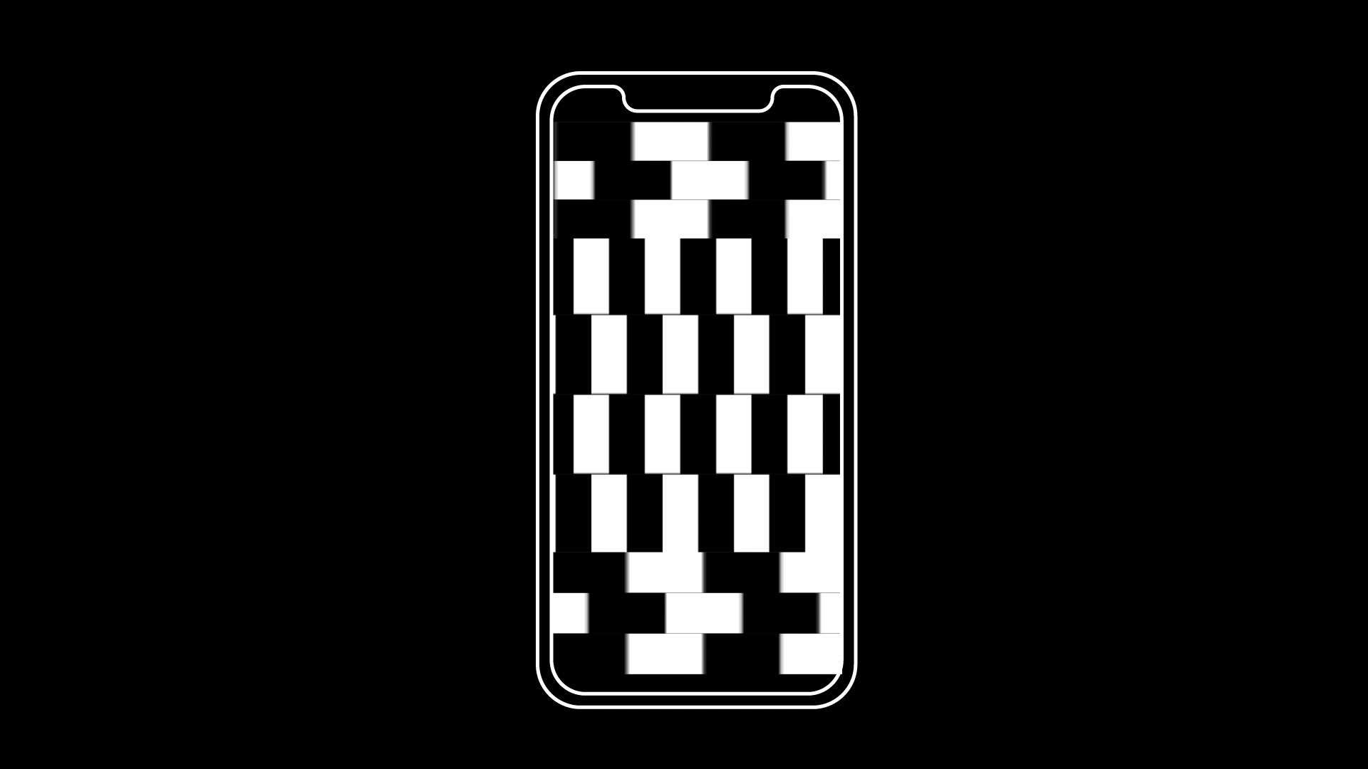
Brand concept for the Museum of Illusion on 8th Ave.
Logo was designed in the light of the typical illusion pattern, and so the square modular system, to bring the museum a modern and compelling look.
Type: Brand Identity, Digital design
Year: Feb, 2019
Year: Feb, 2019
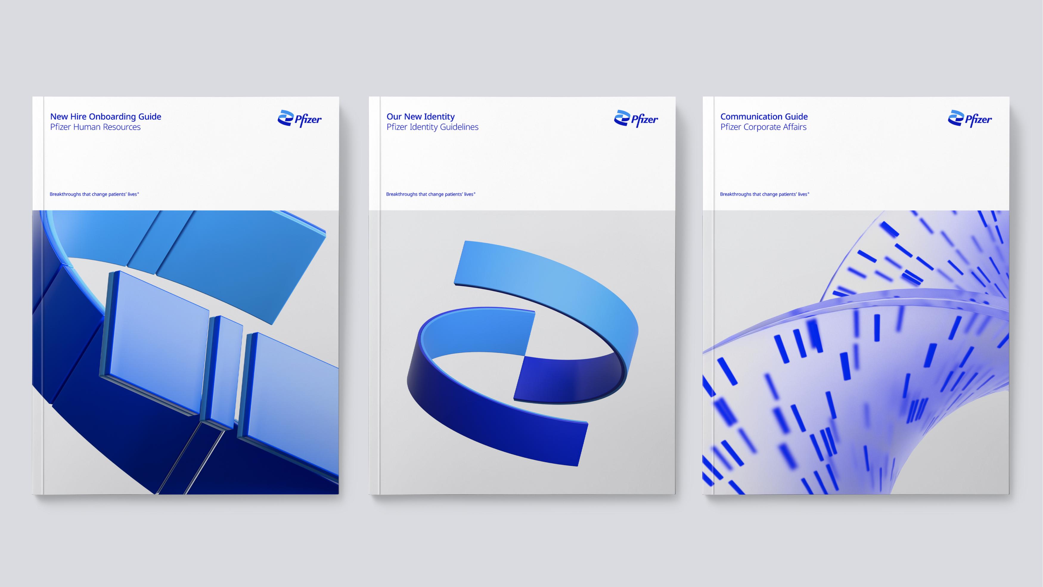


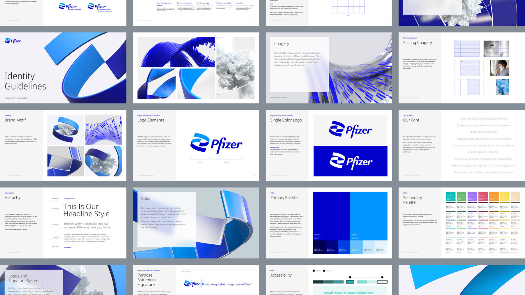
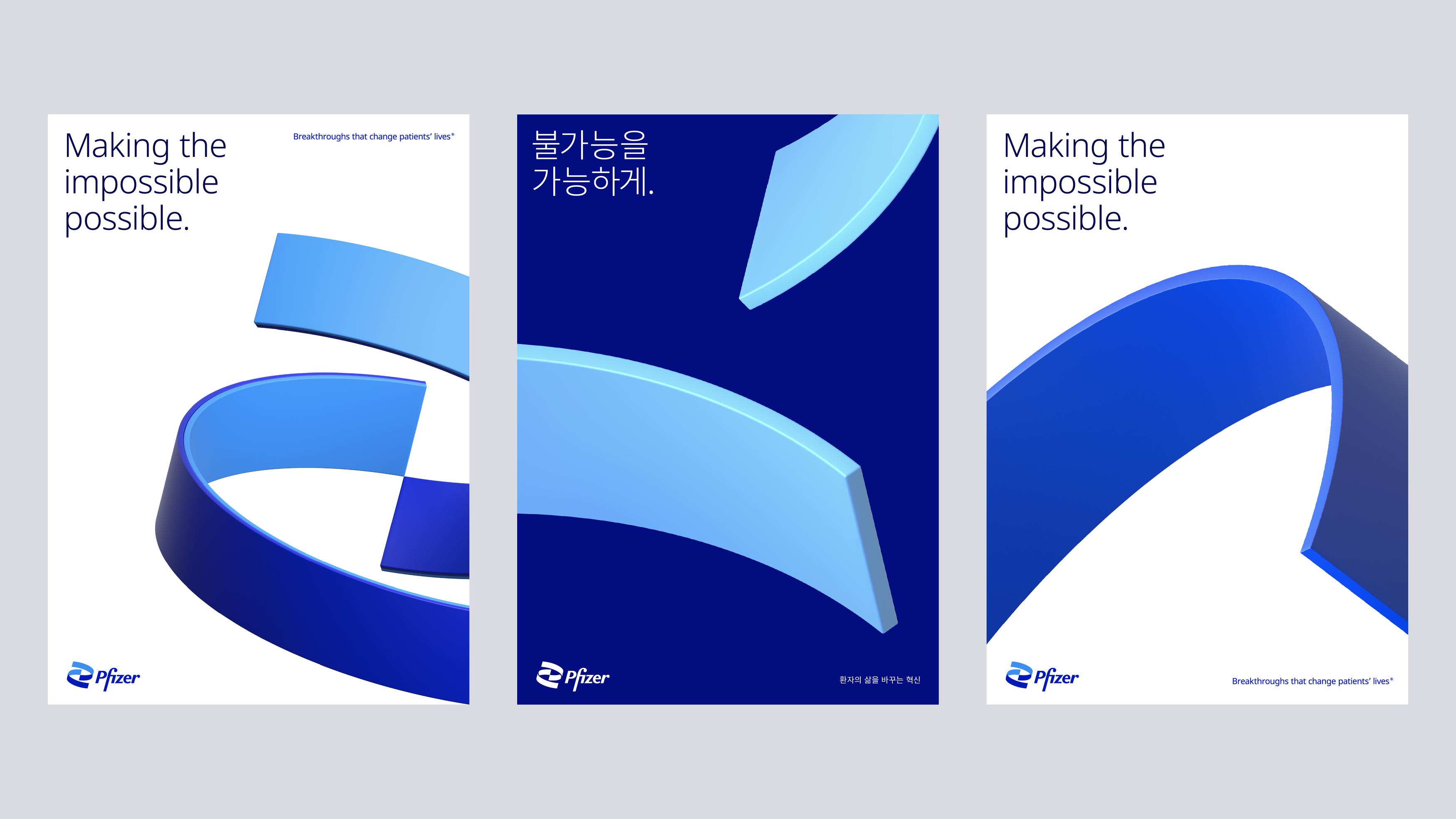
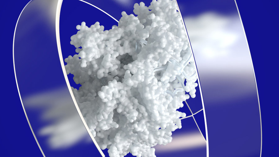
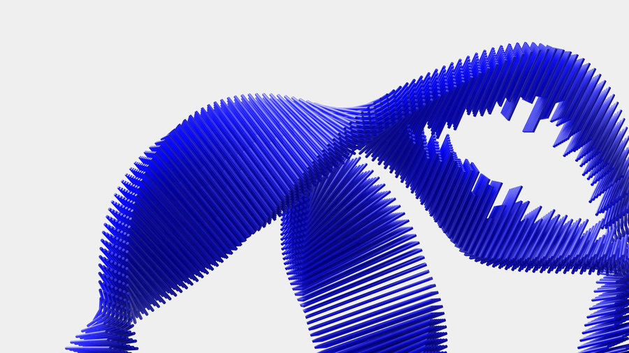

Pfizer is among the largest pharmaceutical companies in the world as well as one of the most recognizable brands across all industries. More importantly, however, they are a scientific powerhouse whose breakthroughs affect the lives of millions around the world every day.
Over the course of the past decade, Pfizer had undertaken an ambitious transformation. The company has narrowed its focus and rededicated itself to developing the next generation of breakthrough treatments. As a result, they have reclaimed their role as trailblazing scientific researchers, makers, and doers with a bold and confident outlook: the new Pfizer is not only treating difficult diseases — they’re curing them.
Pfizer assigned Team to create a new identity to reflect their evolution from a diversified enterprise to a more focused and innovative biopharma company; from a scientific fast follower to a first-in-class scientific leader.
Creative Direction: John Clark, Amy Globus
Creative Production: Samantha Kassay
Art Direction and Design: Sabri Akin, Devin Sager, Nicole Wang, Aida ElBaradei, Mark Wolfe, Jiayue Li, Ioan Butiu, Siavash Khasha, Jeremy Mickel, Aleksander Hamid, Shannon Jager, Edan Esinly
3D and Motion Graphics: Bruno Canales, Luke Guyer, Nil Serraima, Albert Sanjuán, Eric Langlay, Mark Parsons
Sound Design: Jay Pellizzi
Writing: Stewart Stone, Hunter Braithwaite


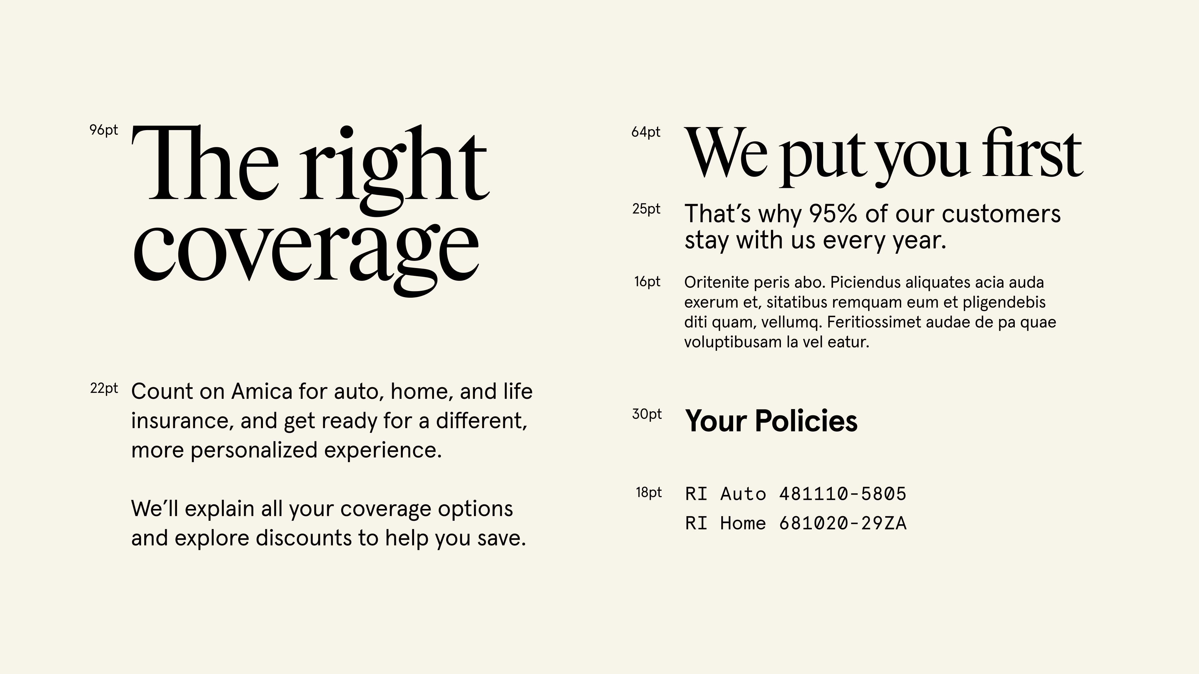


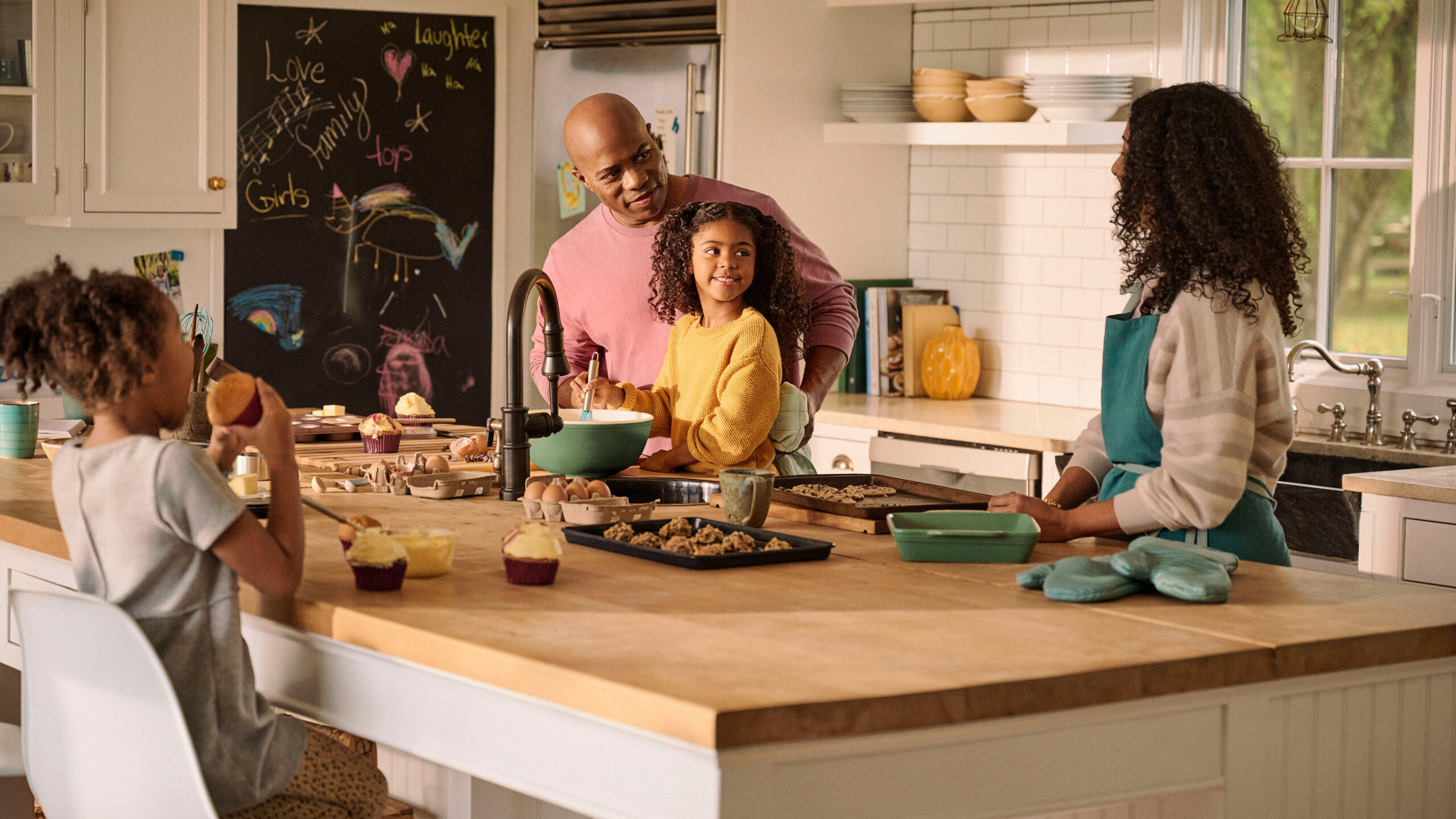
Amica is the oldest mutual insurer of automobiles in the United States, headquartered in Lincoln, Rhode Island. Since 1907, Amica has evolved to provide a wide range of insurance policies, from Home, to Life, to Boat, to Renter’s, and everything in between. Amica’s outstanding customer service has allowed them to retain current customers, rank highly in customer satisfaction, and boast one of the highest percentages of tenured policyholders in the category. Their vision is to be the most trusted and recommended insurer in the United States by creating peace of mind and building enduring relationships.
Amica came to Mother and Mother Design with two significant needs: Awareness and Growth. We sought to define what made Amica different, and establish that point of difference in a way that would engage new customers. Well-known in the northeast of the US, Amica had growth aspirations nationally—they needed a way to generate awareness in a cluttered category which often relies on gimmicks, mascots, and savings-focused messaging.
Our approach was to position Amica as the aspirational alternative to others in a distrusted field. Employing the line “Empathy is our best policy” in concert with our design tenets—Clarity, Approachability, and Focus—we developed an identity system which pulled inspiration from Amica’s past and prepared it for future growth. Instead of distracting people with humor and savings chatter while they’re considering some of the most important purchases of their lives, our communications reflect the truth of who Amica is as a company by highlighting their compassion in times of need.
Inspired by Amica’s logo history, a new wordmark was designed to communicate stability and optimism. The implied infinity loop in the ‘A’ serves as a reminder of Amica’s mission to build enduring relationships.
In a category dominated by red and blue, our teal-centric color palette (with a ‘teal thread’ woven into all art direction) serves as a welcome departure from the norm. Our update made the palette brighter, more modern, and flexible.
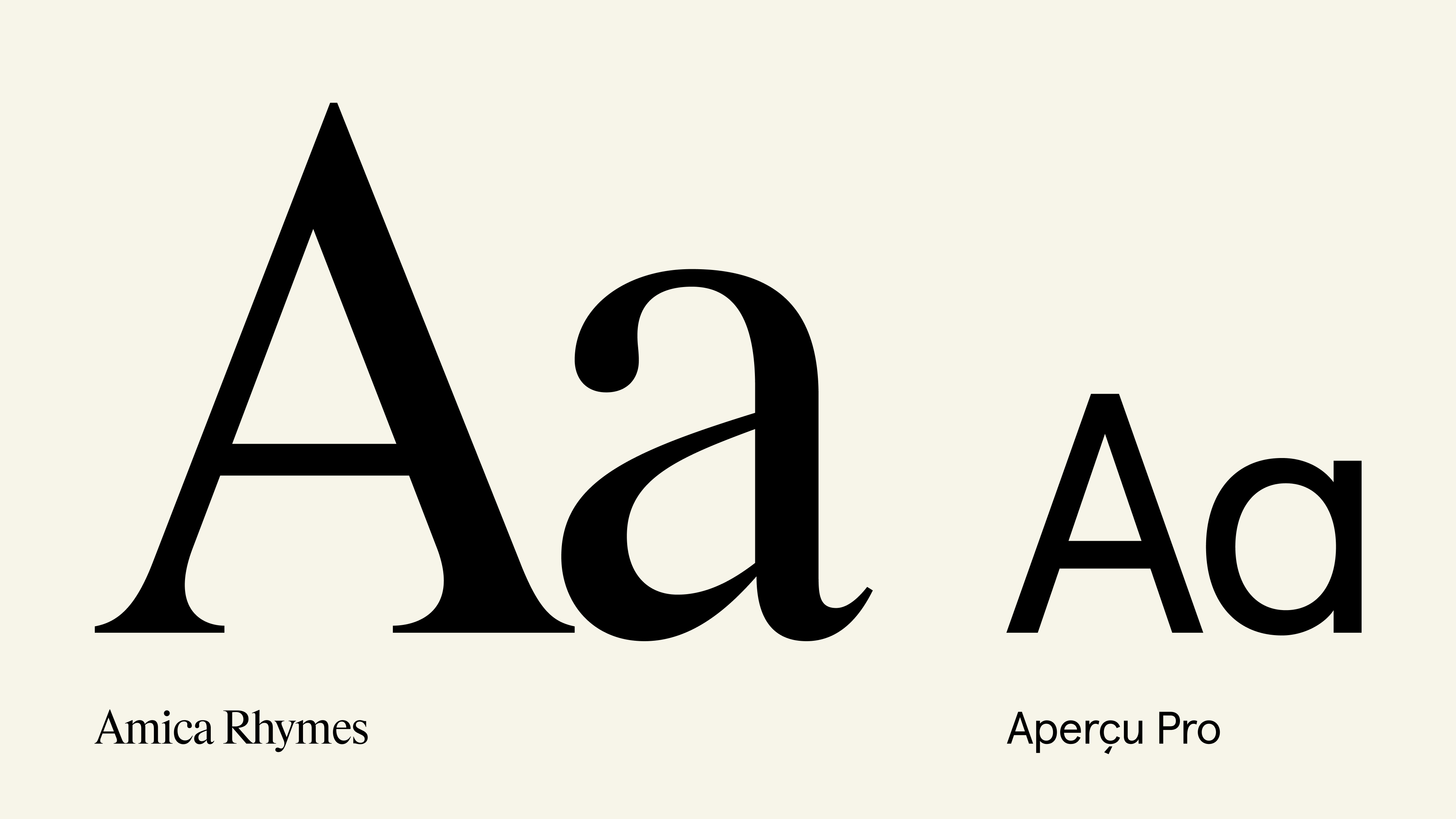
Amica Rhymes (by Maxitype) and Aperçu (by Colophon Foundry) work together as the brand’s typographic voice, further building upon our three design tenets.
Static imagery is used to communicate at multiple levels of complexity, context, and subject matter. To do so, we created three categories—Photography, Pictograms, and Iconography—to clearly and effectively communicate Amica’s story.
We’re excited to work with the Amica team to continue bringing to life a new way of communicating their most important asset: empathy.
Agency: Mother Design
In a category dominated by red and blue, our teal-centric color palette (with a ‘teal thread’ woven into all art direction) serves as a welcome departure from the norm. Our update made the palette brighter, more modern, and flexible.
Amica Rhymes (by Maxitype) and Aperçu (by Colophon Foundry) work together as the brand’s typographic voice, further building upon our three design tenets.
Static imagery is used to communicate at multiple levels of complexity, context, and subject matter. To do so, we created three categories—Photography, Pictograms, and Iconography—to clearly and effectively communicate Amica’s story.
We’re excited to work with the Amica team to continue bringing to life a new way of communicating their most important asset: empathy.
Agency: Mother Design
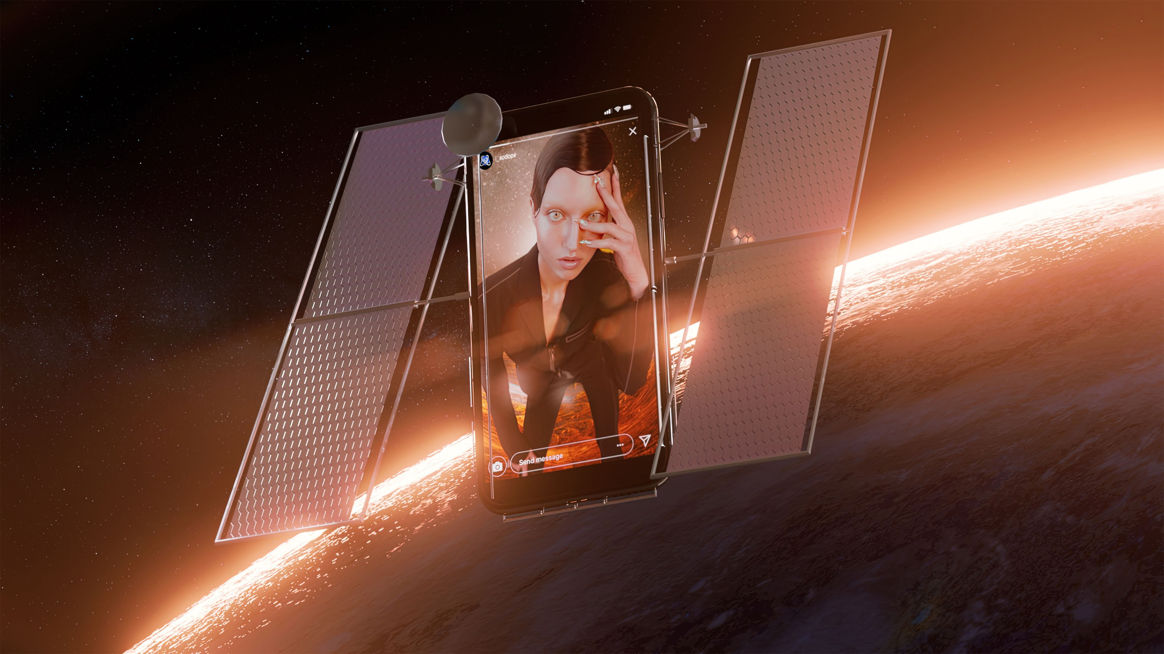


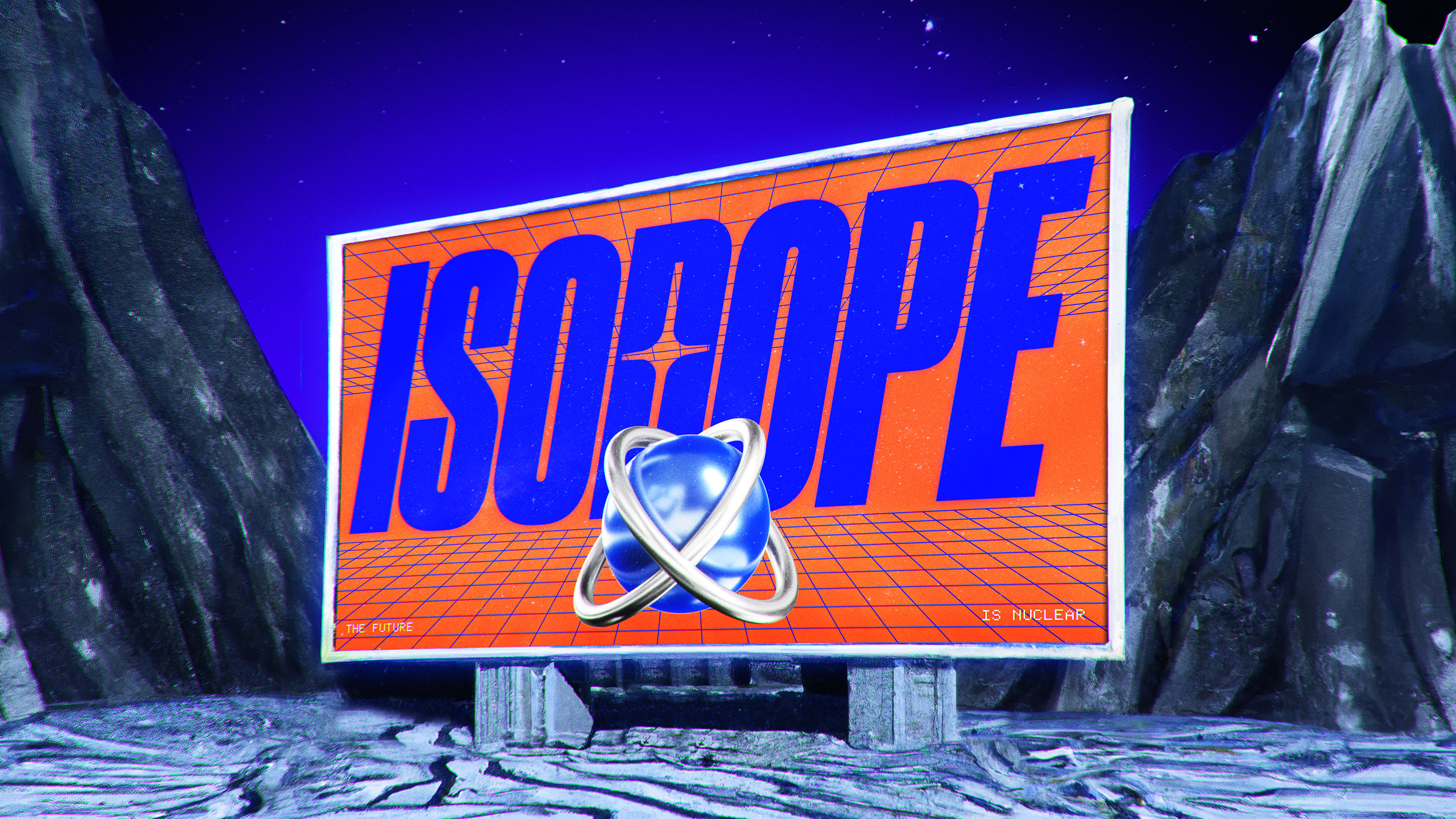


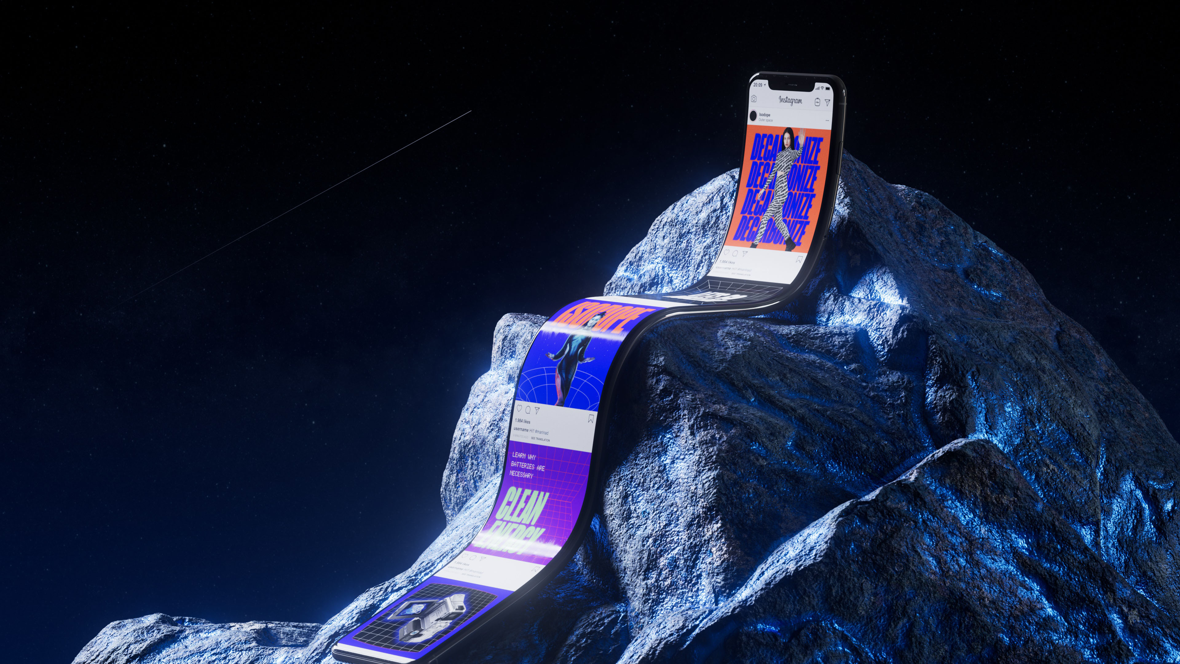


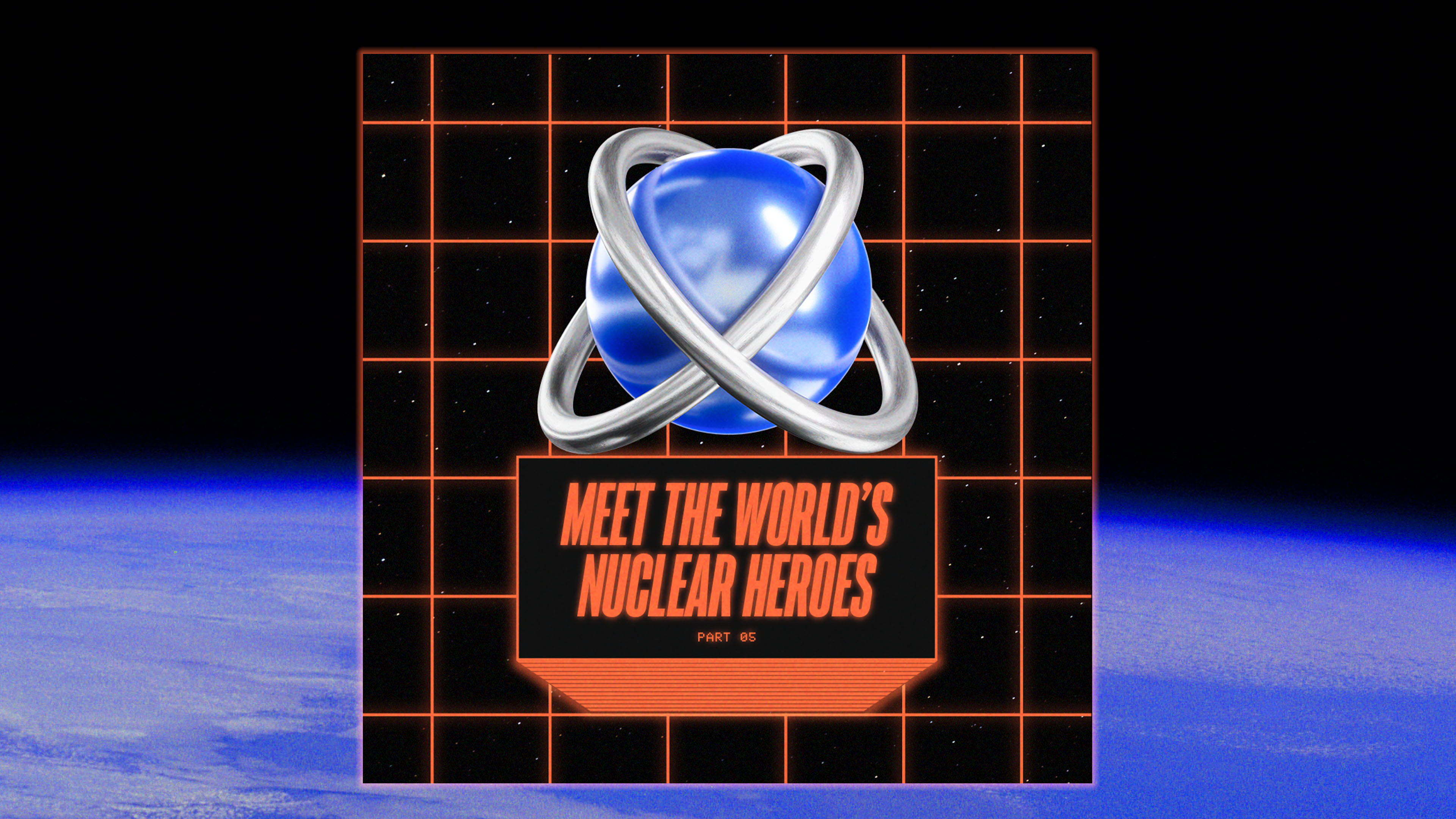


Isodope is the online persona of Isabelle Boemeke, a nuclear energy influencer who wants to change what the world thinks about nuclear, one TikTok video at a time. This is a self-funded project with the goal to change public opinion to help solve the climate crisis.
Nuclear historically has had a bad rep & Isodope's goal is to change the public’s perception on it. After all, it is one of the safest and cleanest forms of energy available to us today. The Isodope persona and brand is built to put people’s fear around nuclear at ease through memes that are easy to digest and even easier to share.
Isodope is changing the face of science communications, to share good ideas and mobilize people behind them. Working with the Isodope team we worked on a brand refresh, a new website (coming soon!), and an extended asset library. Since Isodope is a major proponent of future tools, solutions and the use of technology in daily life, we decided to enlist the creative help of Artificial Intelligence tool DALL·E to bring this branding to life.
Isodope is a not for profit project not affiliated with the nuclear industry or any company. This project is also not sponsored by AI.
For more information about Isodope, visit isodope.com
Follow Isodope:
TikTok @isodope
Instagram @i_sodope
Disciplines: Advertising, Branding, Digital, Social
Client: Isodope, Isabelle Boemeke, Taylor Winnie.
Agency: &Walsh
Creative Direction: Jessica Walsh
Strategy: Lauren Walsh
Executive Producer: Luciana Almeida
Production: Adriano Ellert
Lead Designer: Lucas Luz, Cristina Giménez, Juanse Carvajal, Soomin Jun
AI Creative Prompt Engineers: Jessica Walsh, Lucas Luz, Cristina Giménez
Design: DALL·E, Claudia Nazionale, Javier Gutierrez, Jiayue Li, Juanse Carvajal, Julio Zukerman, Marek Rybicki, Marie Ducrocq, Marina Glikman, Nicole Belskaya, Sasyk Mihal, Shamil Asgarov, Sofia Noronha, Soomin Jun, Emiliyana Kancheva, Fabrizio Morra, Fernando Farfán, Kristýna Jenčová, Tais Kahatt, Zitong Zhao.
3D & Animation: Daniel Zepeda, Eveling Salazar, Kaan Iscan, Lorenzo Cobo, Pablo
Garcia Robla, Yuxin Zhou, Lucas Luz, Claudia Nazionale, Sofia Noronha, Jacob Hwan Lee, Nicole Belskaya, Cristina Giménez. Photography: DALL·E, Chelsea Finkel, Jarett Loeffler, Tiffany Thebodeau.
Models: Isabelle Boemeke


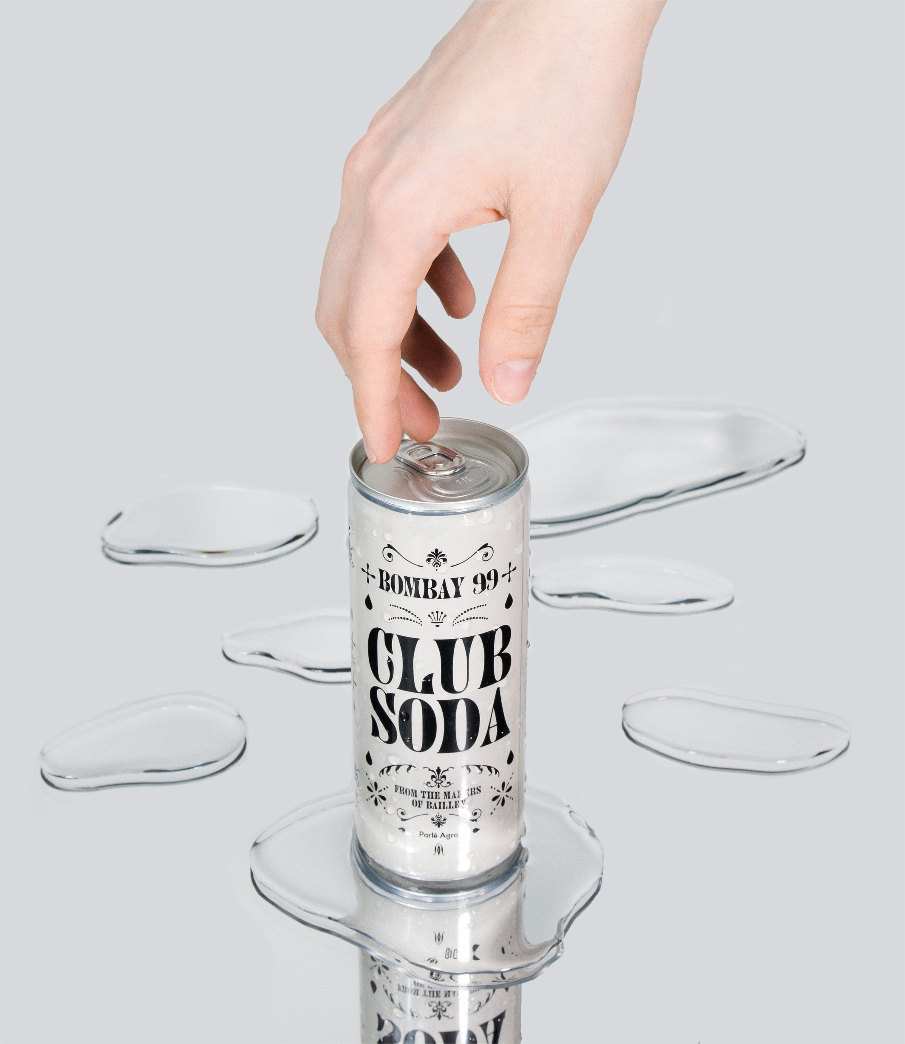


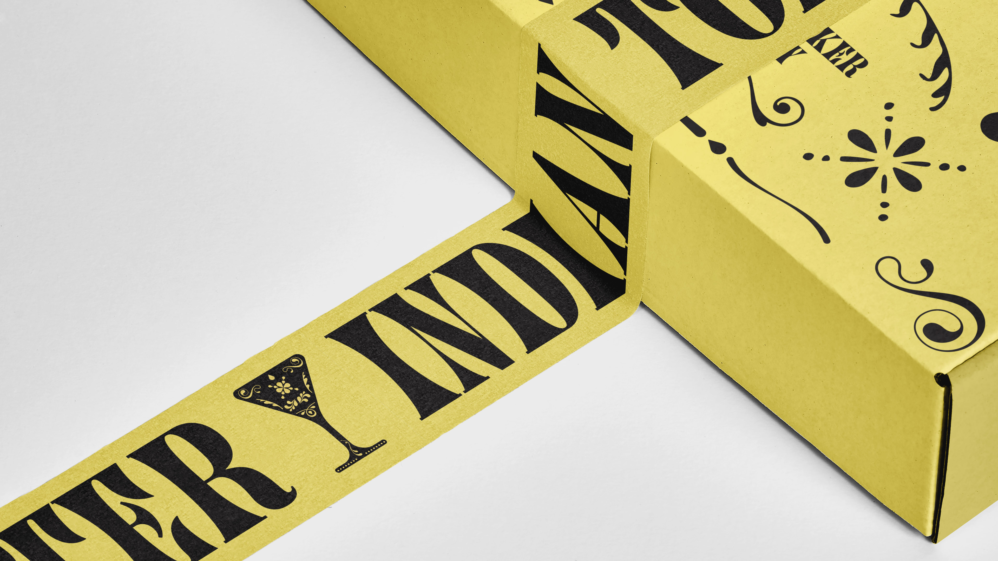

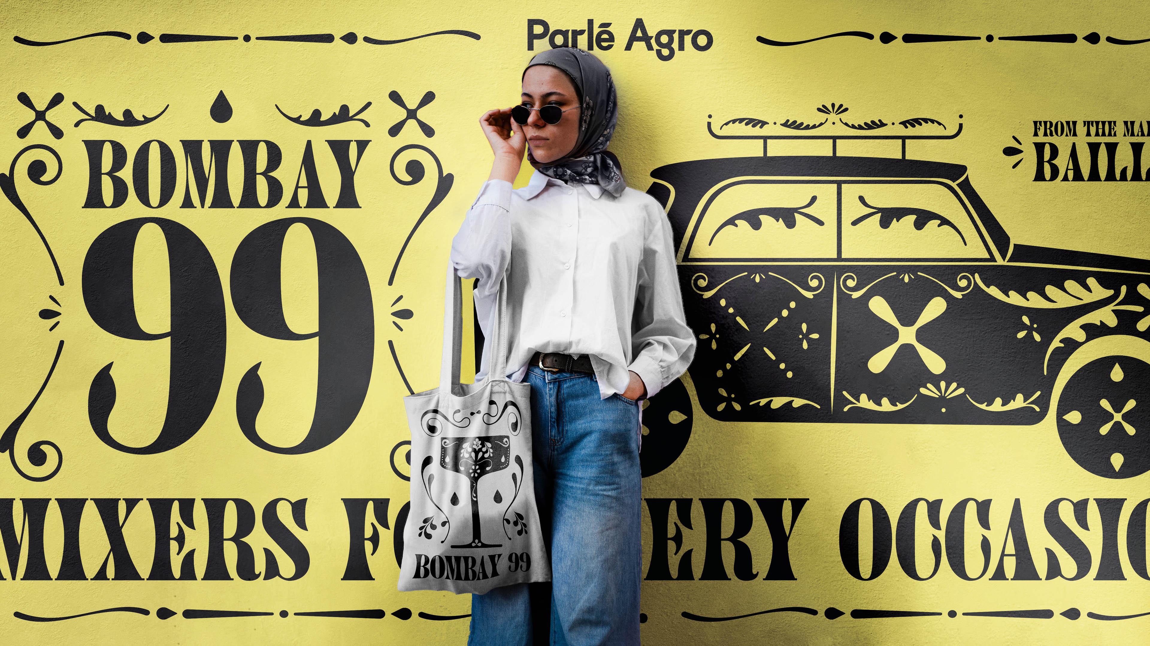
From the makers of Bailley water comes the newest range of mixers crafted to enhance the experience of your favorite drinks. We created the branding & packaging design for the launch of the product line. We brought the branding to life through custom flourishes and ornaments inspired by the shape of a single droplet from a mixer's drink.
Client: Bombay 99 (Mixer) by Parle Agro
Agency: &Walsh
Creative Direction: Jessica Walsh
CMO, Parle Agro: Nadia Chauhan
Strategy: Lauren Walsh
Production: Gosbinda Vizarretea, Allison Raich, Samantha Galvao, Amy Chuyin Liang, Evan Delp
Design Lead: Uting Xie, Lucas Luz
Design: Yijia (Aqua) Xie, Lucas Luz, Kristýna Jenčová, Fabrizio Morra, Jessica Gracia, Juanse Carvajal, Marie Ducrocq, Riisa Liao, Sasyk Mihal, Rita Goulão, Sofia Noronha, Soomin Jung, Tais Kahatt, Zitong Zhao, Andrew Bogard, Oscar Maia, Divya Negi, Uting Xie, Jiayue Li, Simoul Alva
3D Design: Pawel Stojek, Sanchit Sawaria, Lorenzo Cobo, Lucas Luz
Animation: Pawel Stojek, Lorenzo Cobo, Lucas Luz
Illustration: Sanchit Sawaria
Photography: Tiffany Thebodeau, Chelsea Finkel, Jarett Loeffler Retouching:Tiffany Thebodeau