Amica is the oldest mutual insurer of automobiles in the United States, headquartered in Lincoln, Rhode Island. Since 1907, Amica has evolved to provide a wide range of insurance policies, from Home, to Life, to Boat, to Renter’s, and everything in between. Amica’s outstanding customer service has allowed them to retain current customers, rank highly in customer satisfaction, and boast one of the highest percentages of tenured policyholders in the category. Their vision is to be the most trusted and recommended insurer in the United States by creating peace of mind and building enduring relationships.
Amica came to Mother and Mother Design with two significant needs: Awareness and Growth. We sought to define what made Amica different, and establish that point of difference in a way that would engage new customers. Well-known in the northeast of the US, Amica had growth aspirations nationally—they needed a way to generate awareness in a cluttered category which often relies on gimmicks, mascots, and savings-focused messaging.
Our approach was to position Amica as the aspirational alternative to others in a distrusted field. Employing the line “Empathy is our best policy” in concert with our design tenets—Clarity, Approachability, and Focus—we developed an identity system which pulled inspiration from Amica’s past and prepared it for future growth. Instead of distracting people with humor and savings chatter while they’re considering some of the most important purchases of their lives, our communications reflect the truth of who Amica is as a company by highlighting their compassion in times of need.
Inspired by Amica’s logo history, a new wordmark was designed to communicate stability and optimism. The implied infinity loop in the ‘A’ serves as a reminder of Amica’s mission to build enduring relationships.
In a category dominated by red and blue, our teal-centric color palette (with a ‘teal thread’ woven into all art direction) serves as a welcome departure from the norm. Our update made the palette brighter, more modern, and flexible.
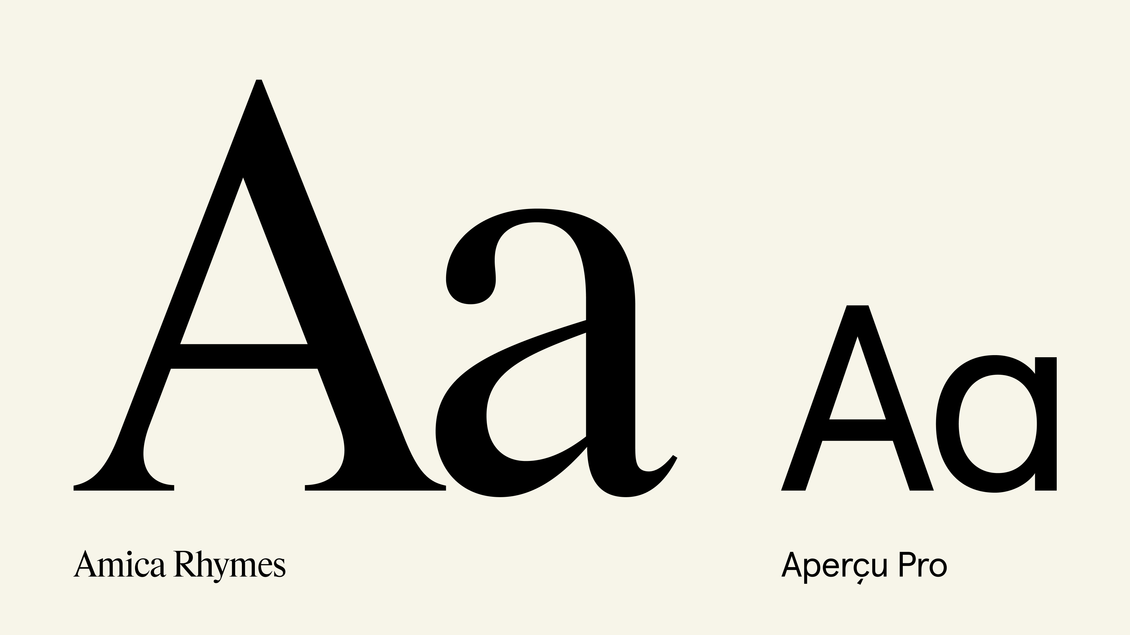
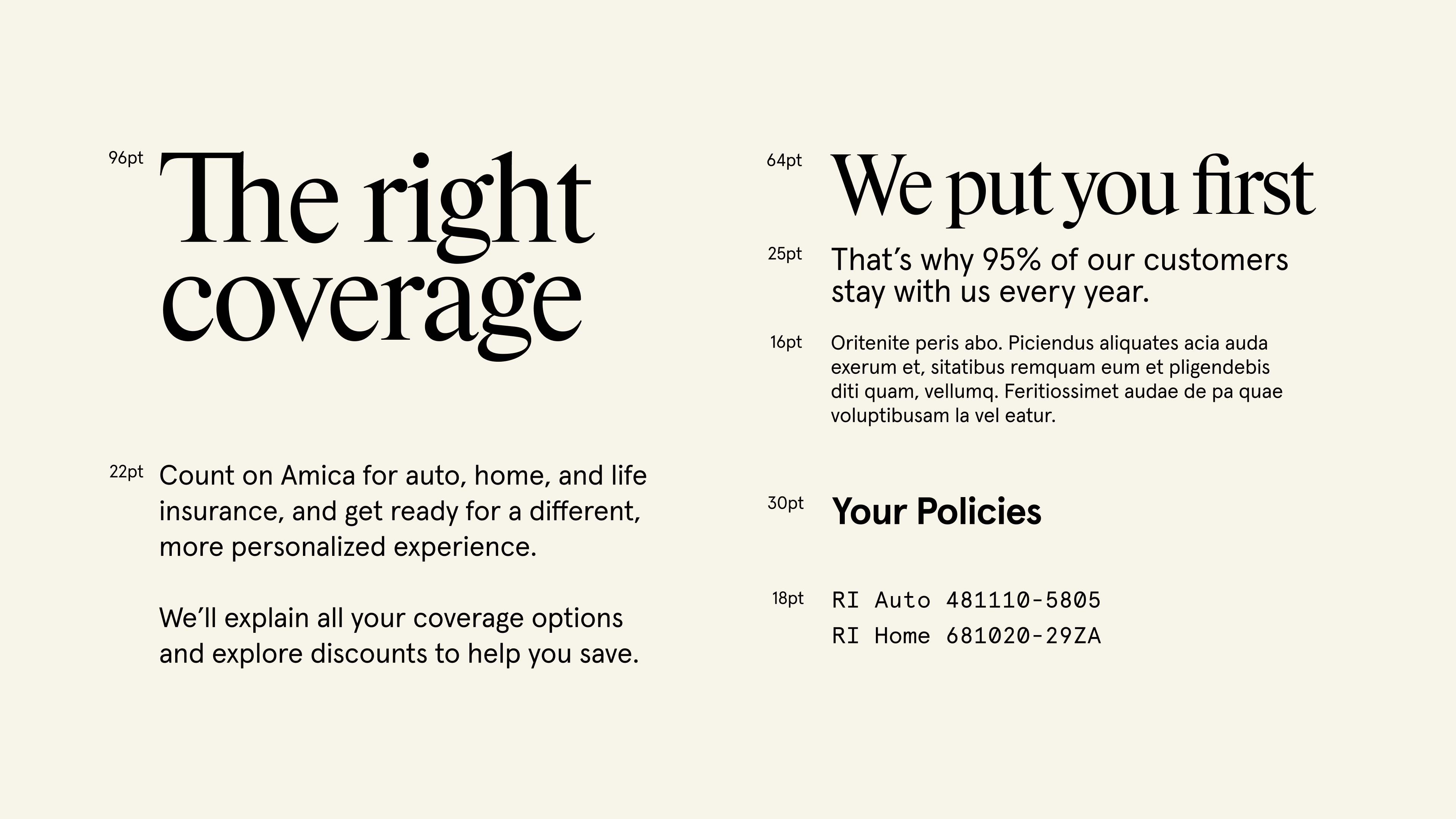
Amica Rhymes (by Maxitype) and Aperçu (by Colophon Foundry) work together as the brand’s typographic voice, further building upon our three design tenets.
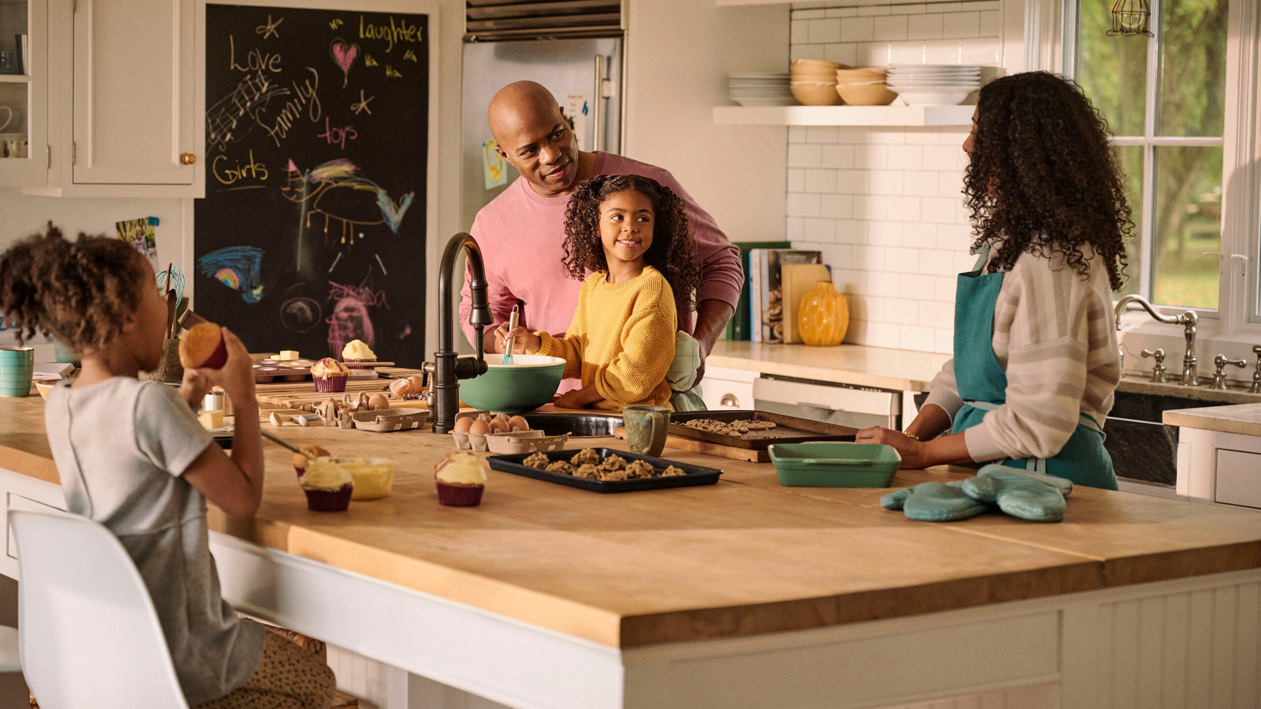
Static imagery is used to communicate at multiple levels of complexity, context, and subject matter. To do so, we created three categories—Photography, Pictograms, and Iconography—to clearly and effectively communicate Amica’s story.
We’re excited to work with the Amica team to continue bringing to life a new way of communicating their most important asset: empathy.
Agency: Mother Design